GRAZ
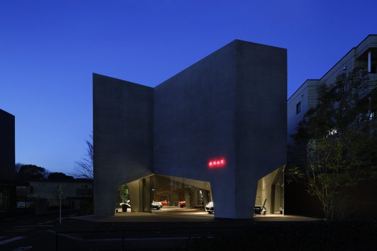
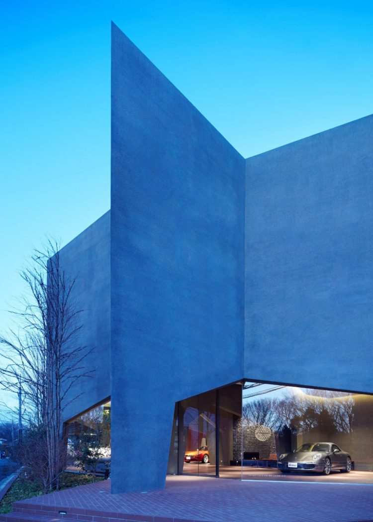
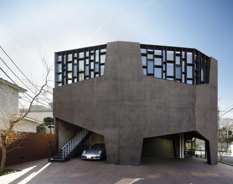
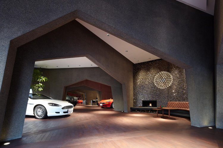
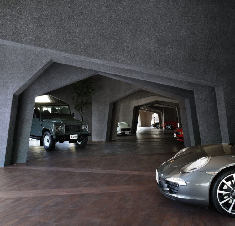
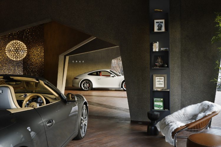
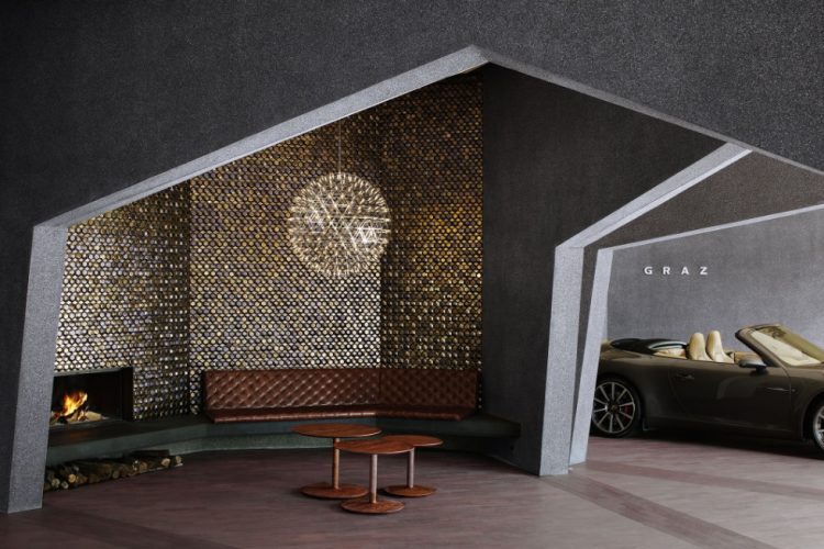
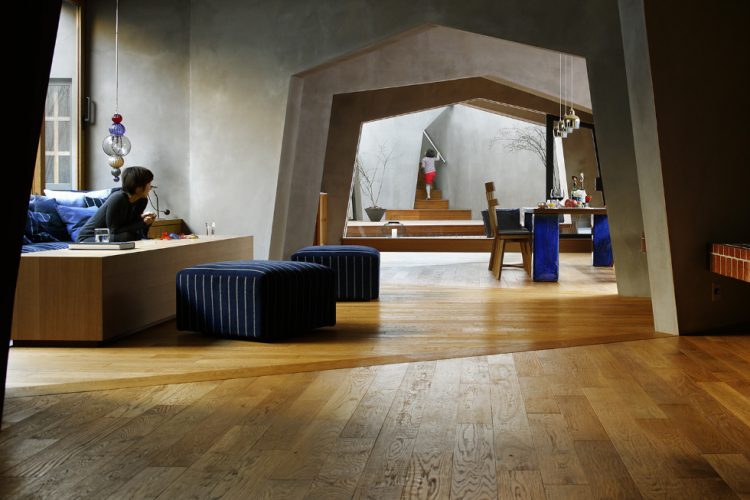
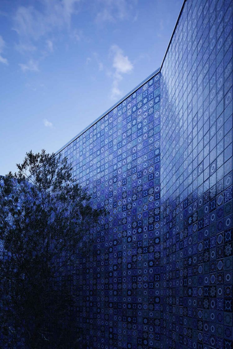
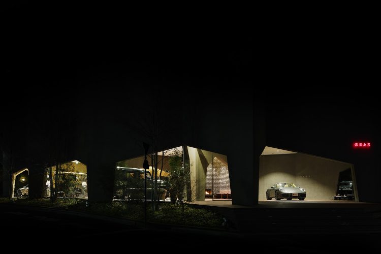
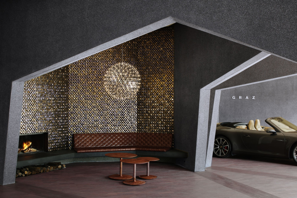
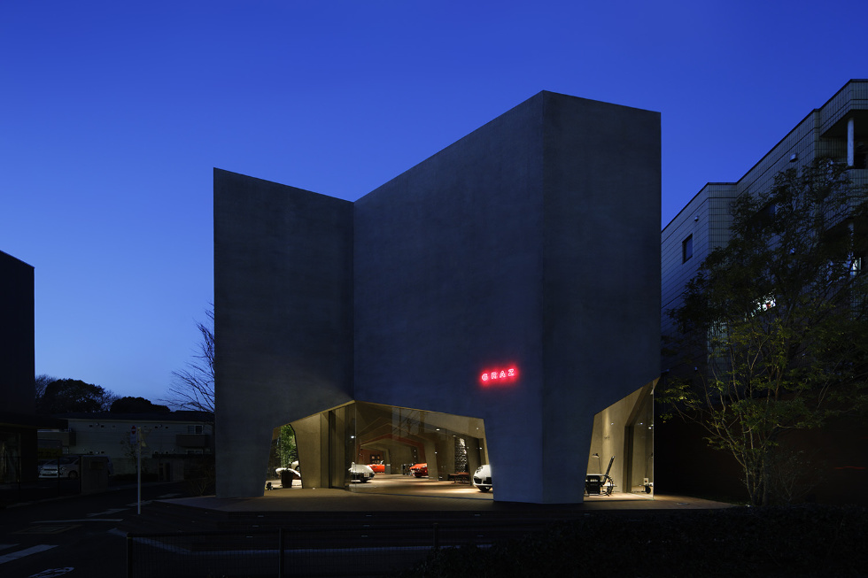
The building houses a showroom for sales of imported cars and the client’s residence. The client sought a large space for displaying cars downstairs, and a similar large space for collective family living upstairs. If only large, the spaces would not be comfortable, so we therefore clustered personal spaces—the optimal size for a car, on the first floor, and for a sofa or table, on the second floor—and produced two large clusters of personalized yet integral spaces.
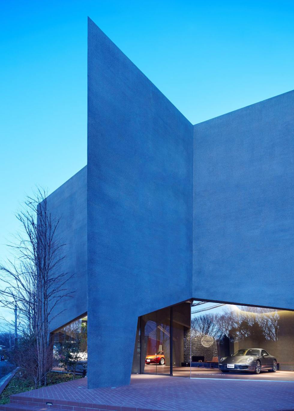
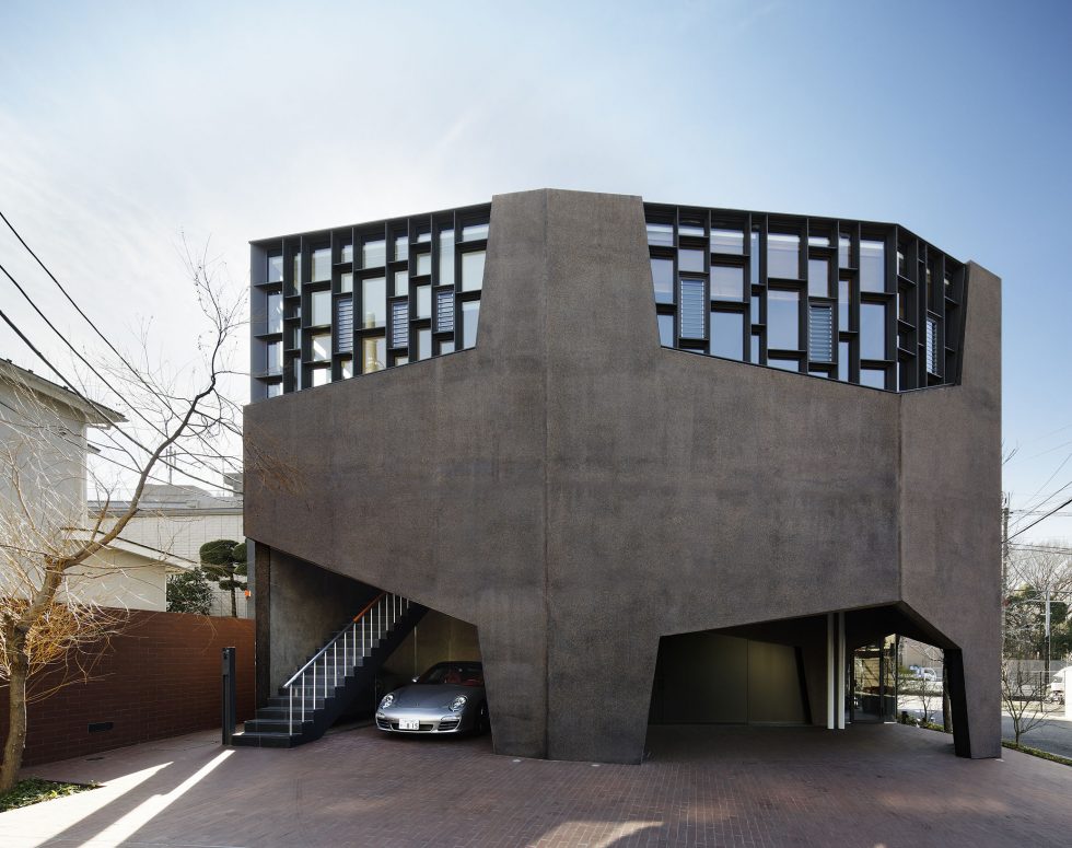
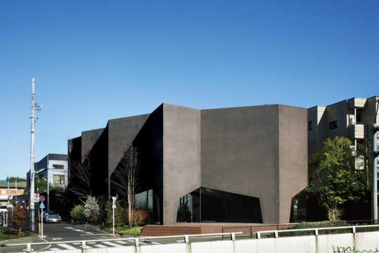
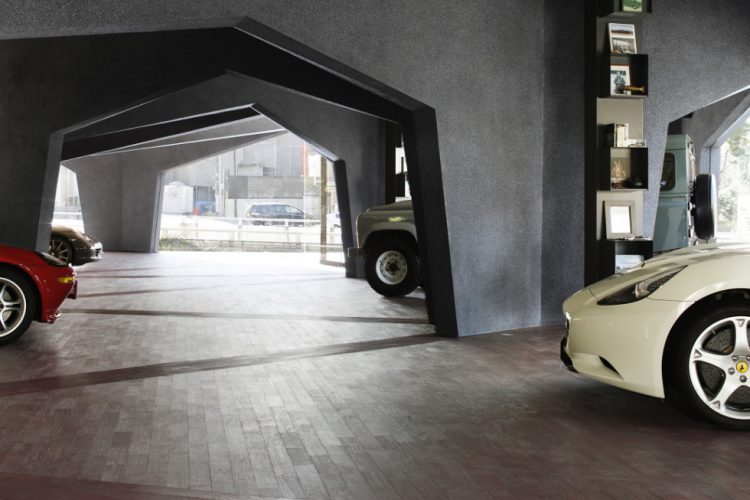
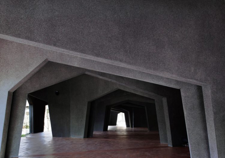
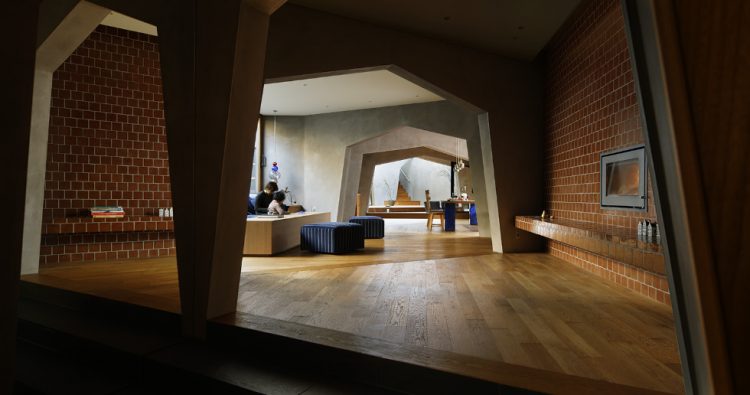
To begin, we chose a hexagon for the shape of the rooms: by sharing parting walls, the hexagonal rooms would enhance the building’s strength and improve its economic efficiency. Structural walls comprise three sides for each hexagon, and arch shaped openings for the other three. This efficient form is a direct translation of the stress diagram, where structural elements are concentrated at points where the bending moment is greatest.
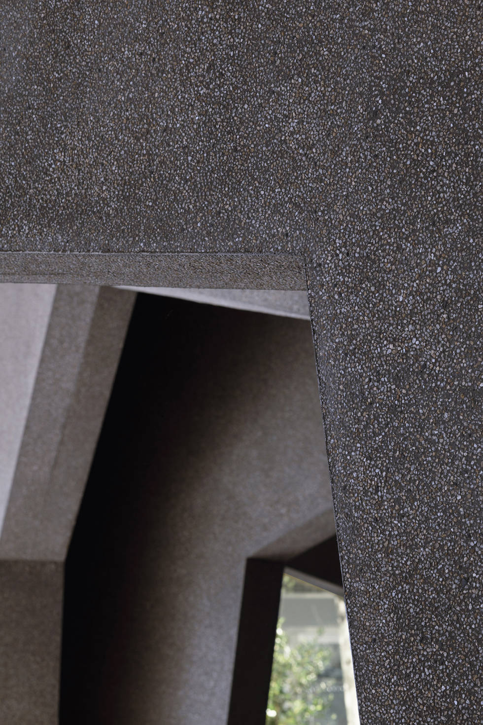
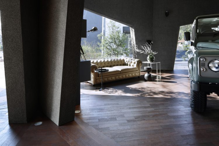
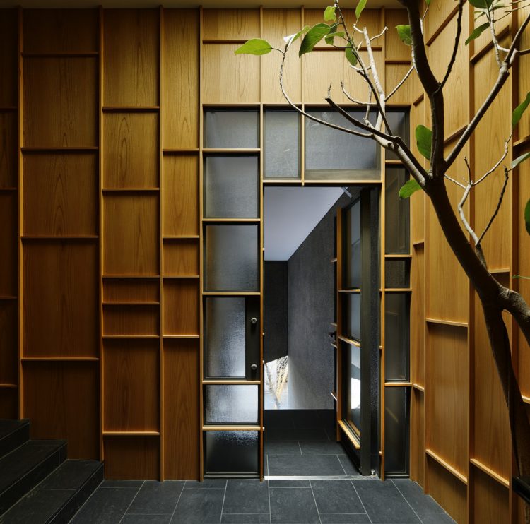
The typical car showroom employs smooth stone or metal panels in seeking a harmony with the cars. Such an approach, however, detracted from the comfort of the space. On the other hand, if an earthen or wood finish were employed, the harmony with the metal and glass car body would be lost. Conducting various studies, we found we could harmonize the architectural space with the metallic car by minutely adjusting the visual hardness of the materials used. Mixing in Sakura River pebbles, we obtained an intermediate half stone-like, half earth-like finish. Emphasizing the sharpness of the wall corner further served to underscore that visual hardness. The floor is finished in brushed karin wood, a material that resists scratching while displaying the warmth of wood.


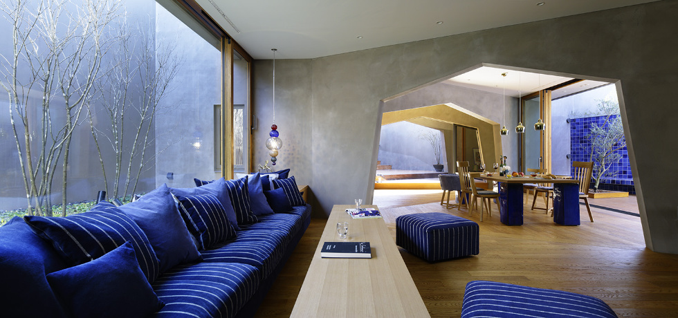
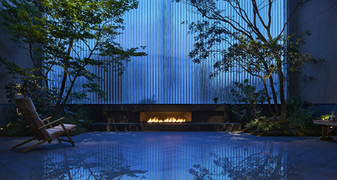
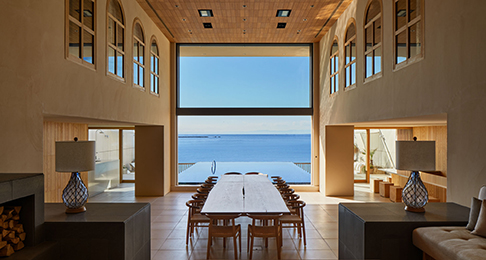
The second floor residence is also a large, personalized yet integral space. In the dining room is a table, in the living room, a sofa, and in the studio, a desk: thus, the space is broken up and each room given a single function. Terraces are inserted outside the rooms to shut out street noise and bring in light and breezes. The strong territorial character of a hexagon spills outside, and ambiguity is born between the interior and exterior of the building.
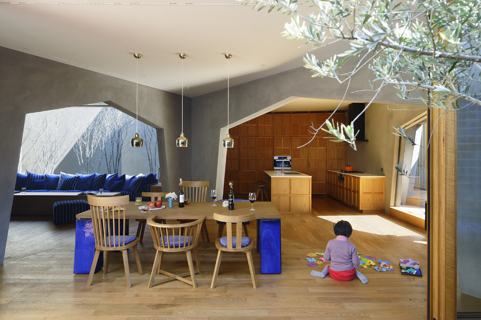
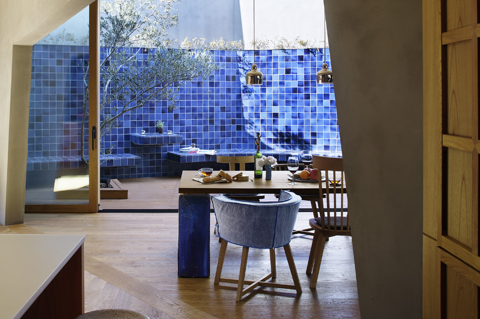
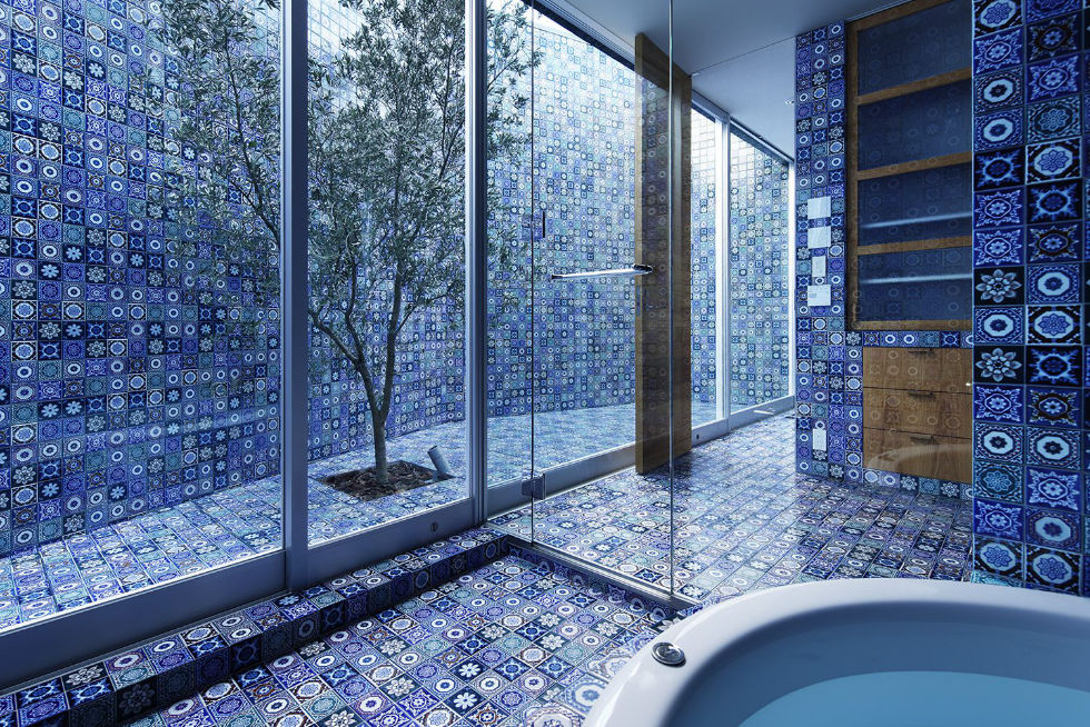
Comfortable rooms—inserted, wedge-like, in the family’s traffic line. Like the wedge’s vector of force, the awareness of family members is directed toward adjacent spaces. Even when unable to see one another, they dwell with a strong sense of being together.
- Completion
- 2012.12
- Principal use
- Showroom and Residence
- Structure
- Reinforced Concrete
- Site area
- 608㎡
- Total floor area
- 682㎡
- Building site
- 2-36-6, Todoroki, Setagaya Ku, Tokyo
- Structure design
- yAt Structural Design Office
- Contractor
- SATOHIDE
- Lighting
- Shinji Yamaguchi / On & Off
- Pendant Light
- Yudai Tachikawa / t.c.k.w
- Books and Accessories Select
- Toshie Tanaka
- Team
- Naoko Sumitani, Hirotoshi Koizumi
- 日本商環境設計家協会 JCDデザイン賞2013 金賞 小坂竜賞
