Tokyo International Airport Terminal2 Extension
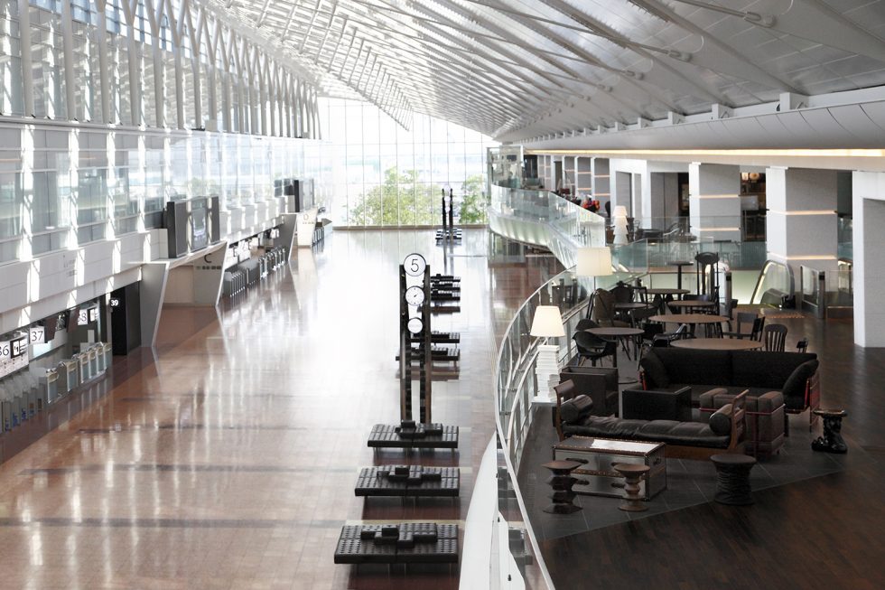
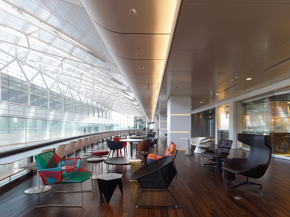
We supervised the design of Tokyo International Airport (Haneda) Domestic Terminal 2 Extension. To bring out the experience-value unique to airports, impart a Tokyo flavor, and reinforce commercial functions, we gave special care to the design of fine details in every aspect, from retail store composition to furniture, lighting, and wall materials.

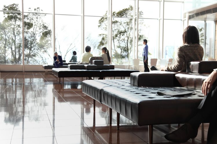
Spaces in public transportation facilities tend to deviate from human scale. Giving thought to this aspect, we created square, terrace-like sofas for the second floor departure hall. The sofas have small elevations in the middle. Passengers can lean back, set down their belongings, or even take their shoes off and sit cross-legged, and freely discover their own way to relax on the sofa. We were delighted to see small children playing in the central enclosure formed when adults sit on all four sides of the sofa—a safe and gentle space formed spontaneously by the backs of strangers. This epitomized the character of public space we had sought to realize—a small, warm space, formed by people’s backs, in the grand space of the departure hall.
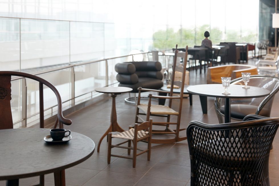

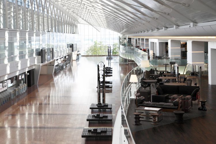
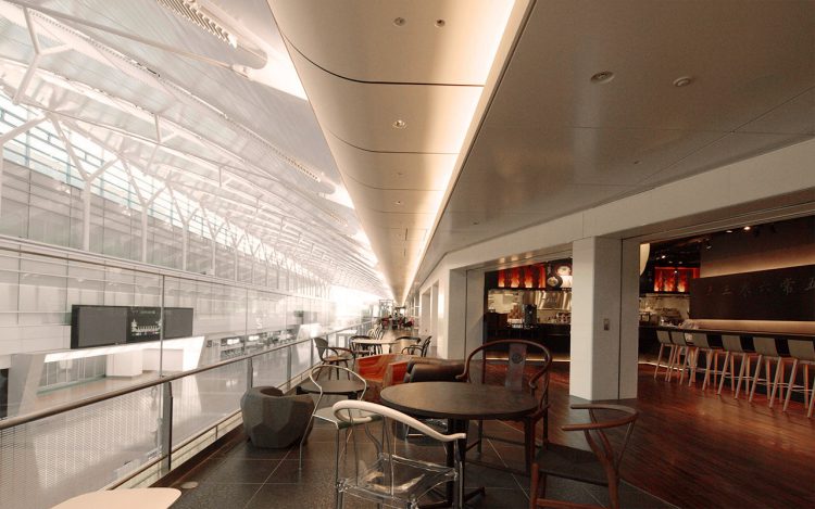
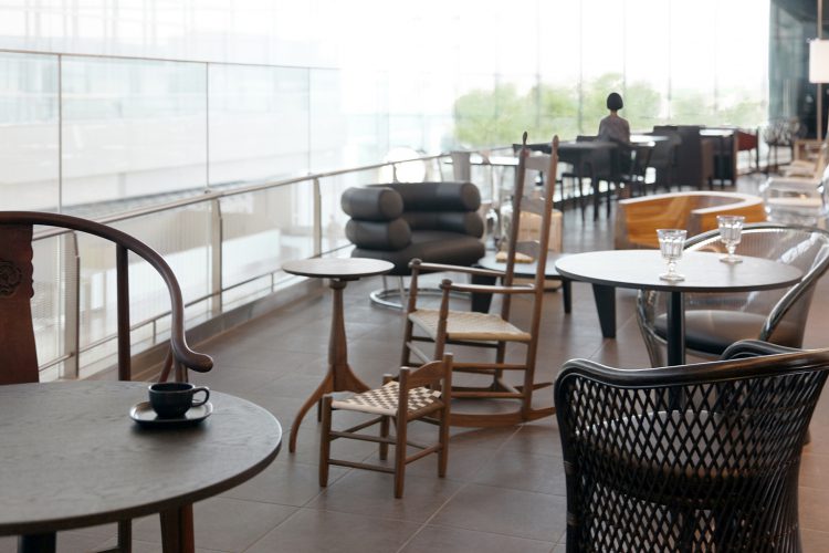
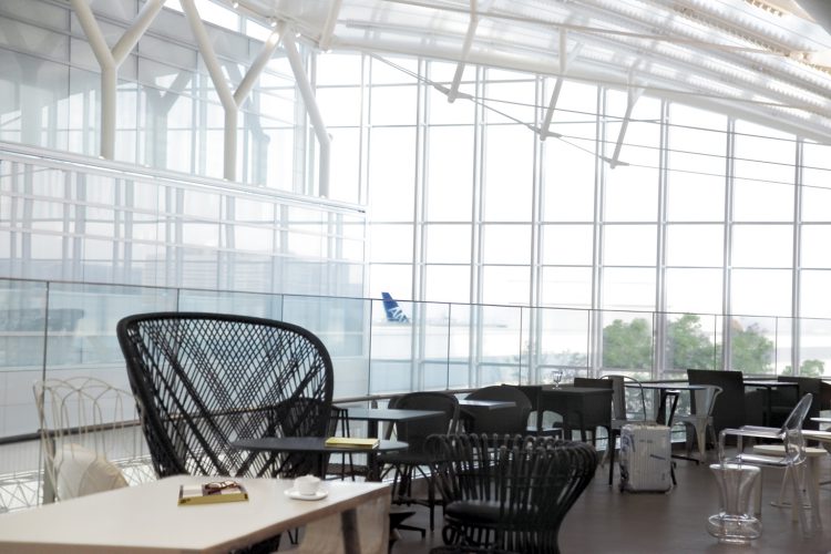
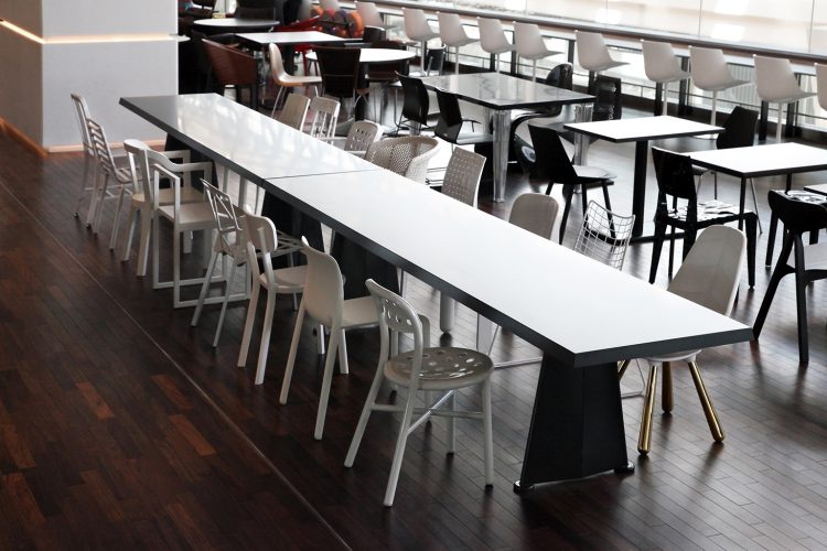
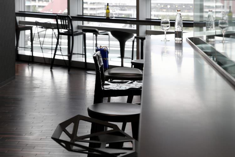
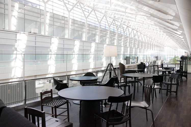
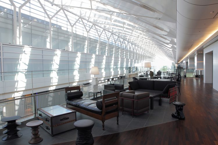
The departure hall’s upper deck is a restaurant zone. In contrast to the clear separation of hall and restaurants in the existing building, we minimalized the restaurant spaces by adapting a take-out format and expanded the hall overlooking the void to create a passenger zone. Here, in a space unique to the airport, passengers can gaze up at the sky they will be flying into or down at the throngs of people coming and going below. Unifying the common-use areas with white marble walls, we placed 250 chairs before them, each different in type and shape, to encourage passengers to relax in the way that individually suits them. Typically, many chairs of a single type are provided in such a place, with result that passengers find it hard to remember where they previously sat and passed the time. If they can sit in a chair of different mood each time, they will remember the chairs they used in the past and begin to develop affection for the place.
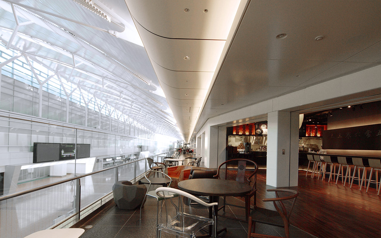
Commercially as well, the varied chairs enliven the atmosphere and keep a sense of dreary desolation at bay when there are no passengers. Chairs of similar shape and construction are combined at each table. A Hans Wegner chair, for example, is placed with the Chinese Ming dynasty chair that influenced its design. The chair combinations evoke chair history and transitions in chair design.
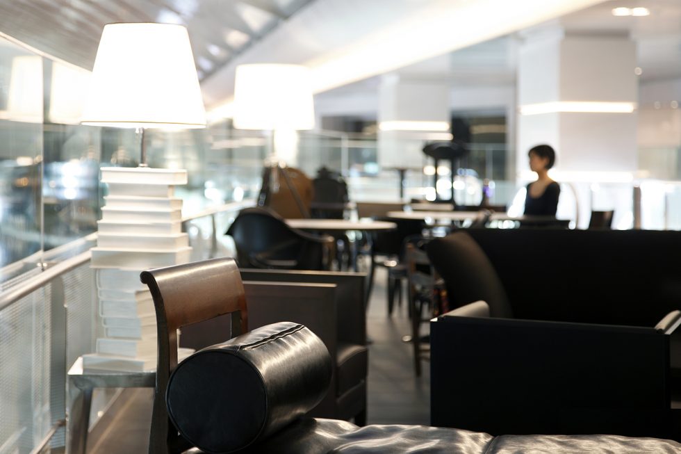
Until now, the airport has been a place where strangers simply leave behind without thought. Here, however, one can imagine other people’s tastes, level of fatigue, and relationship within a group from the chairs they choose to sit in or offer to each other. This makes it a fun place to watch people. Awakening people`s imagination towars to the presence of other people around them—this, we felt, is what the public space in the future really needs.
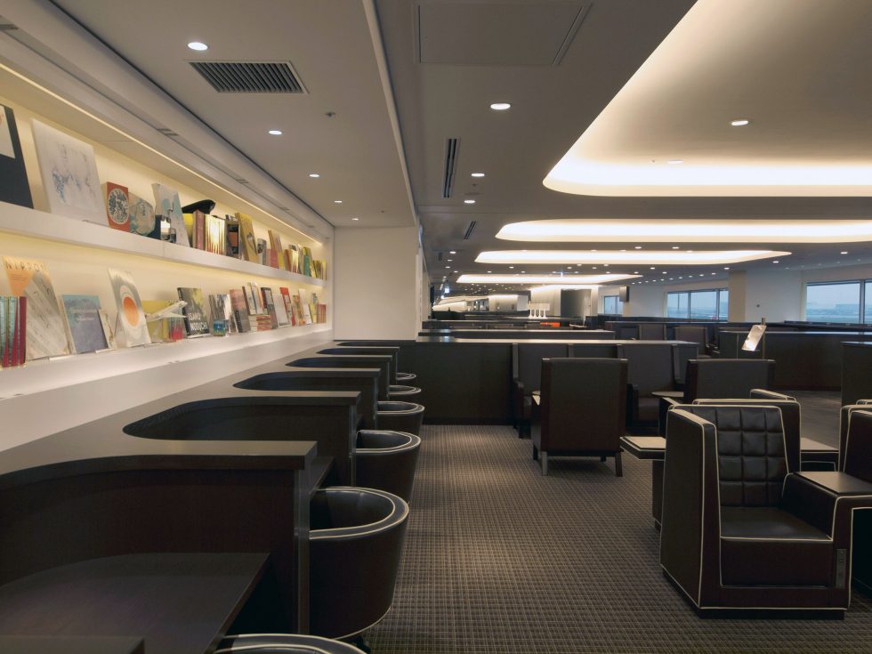
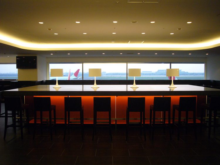
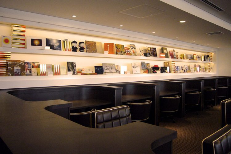
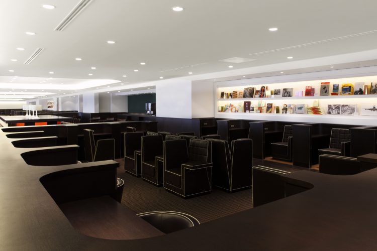
The JAL Sakura Lounge & Diamond Premium Lounge is a big project which scales nearly 5,500 ㎡, and houses 990 seats for travelers. We supervised the total design and made the basic plan of this project. The low height of the ceiling (2.5m) was the problem to renovate the floors that were used as office spaces. If we put up walls from floor to ceiling and divide small rooms, the view becomes narrow and oppressive, and the the sound will resonate in rush hours. In addition, with such a narrow space, there is a problem that the sheets occupancy becomes unbalanced,with the seats near the entrance used most frequently.
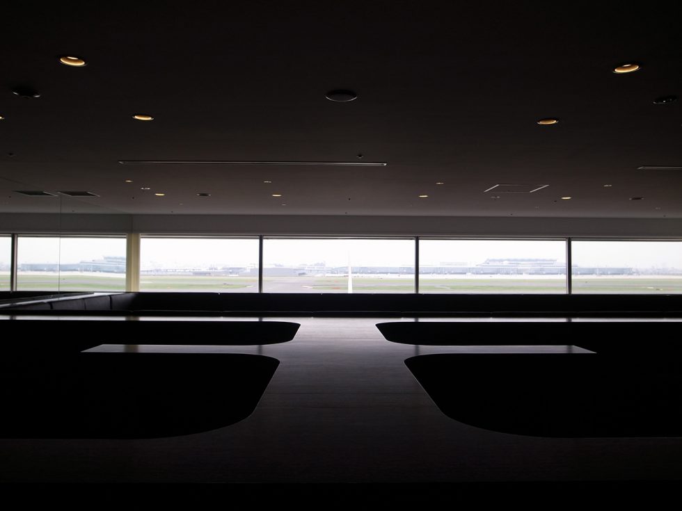
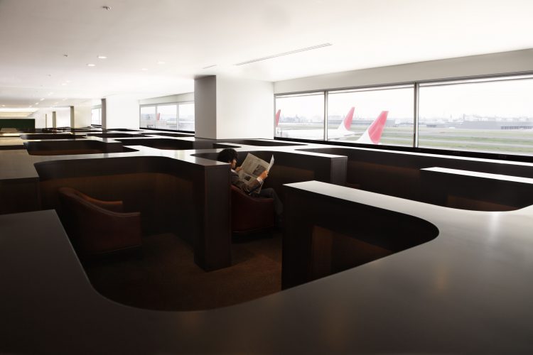
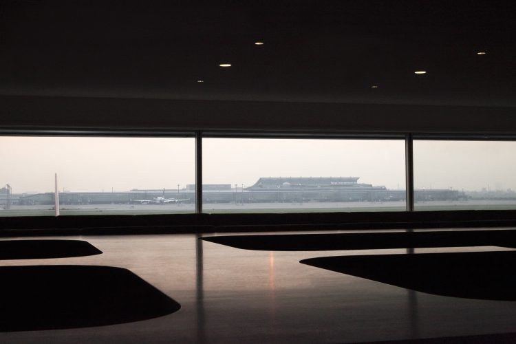
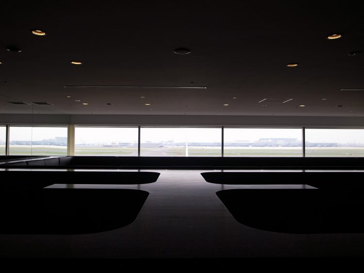
Therefore, I diagnosed the height of the waist from the floor as a solid volume, and extracted places which the travelers move and stay, and we opened the horizon from the waist level upwards. As a result, views to the runway and the whole lounge were secured for the visitors standing and moving,allowing them to spot vacant places at first sight. For visitors sitting down, visually obstructive elements such as other visitors or bags, window flames, and existing fan-coil units, were hidden behind a breast wall, reducing visual congestion. Furthermore, the breast walls absorb sounds, creating a very quiet environment.
The exquisite height of the breast walls were designed so that visitors will not be completely hidden even if they sit down, while ensuring their privacy. This also secures the efficiency of visitors' search for seats and the service of the waiters.

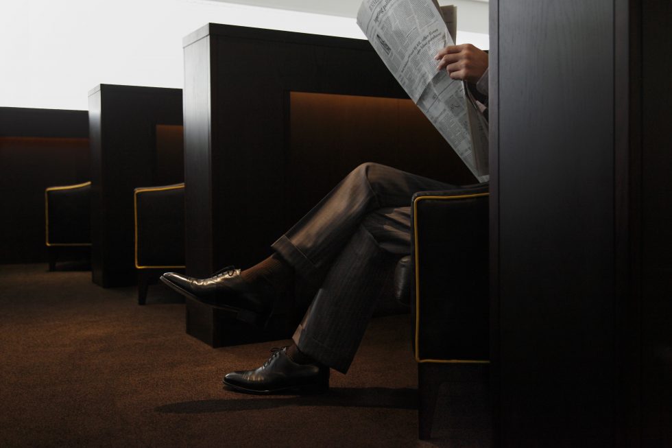
To "stay" in the space dug in the ground before taking off for the sky, I think is the contrasting experience suited for the airport lounge, located in between ground and the sky.
- Completion
- 2010.10
- Principal use
- Airport
- Structure
- S + SRC
- Site area
- 943,664㎡
- Total floor area
- 49, 381㎡
- Building site
- Hanedakuko, Ota-ku, Tokyo,
- Contractor
- TAISEI
- Planning and Coordination
- TRANSIT GENERAL OFFICE
- Detailed Design
- Azusa Sekkei
- Book Direction
- Yoshitaka Haba/BACH
- Team
- Ikuma Watase, Tomohiko Kimura

