TOKYU PLAZA OMOTESANDO HARAJUKU

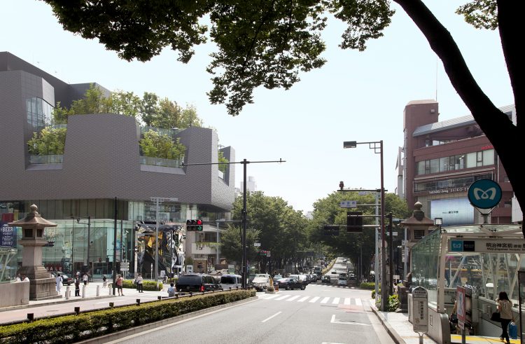
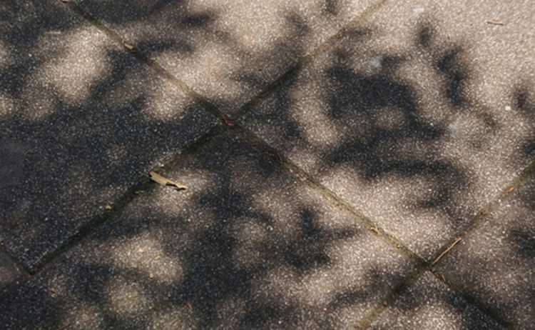
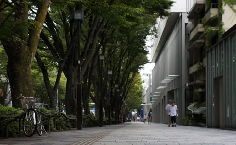
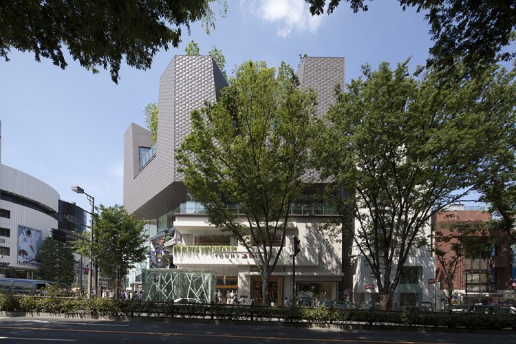
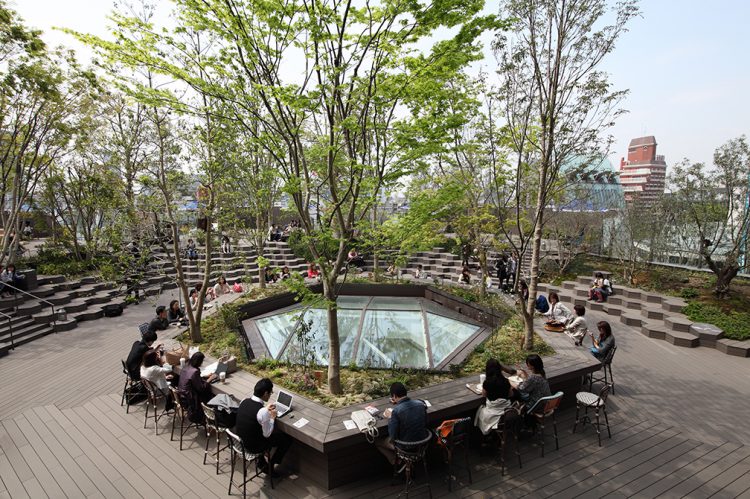
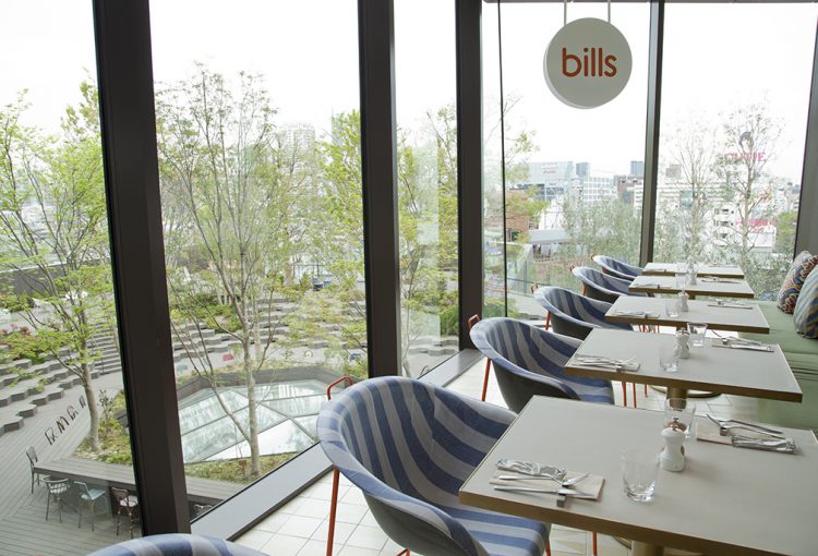
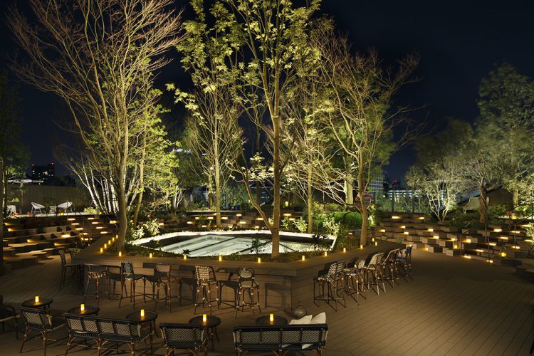
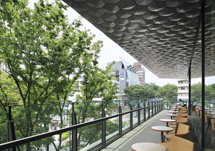
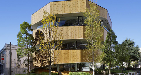
Omotesando, an avenue lined with the flagship stores of international fashion brands, is one of Japan’s foremost fashion streets. As the frontal (“Omote”) approach to the wooded compound of Meiji Shrine, the avenue is lined on both sides with zelkova trees. The branches of the trees form a canopy over the avenue and provide an experience of shopping under sunlight filtering through trees. An environment that blends architectural spaces with spaces under trees—such is the special character of Omotesando, we felt, and we therefore proposed a style of environment giving emphasis to this special character. In concrete terms, we sought to give the space of the avenue below the trees a phased connection with the upper portion of the building, by floating a volume that merges the building with the zelkova trees in the sky. This not only allows birds and butterflies to easily ascend to the roof-top forest; a roof garden there also gives people an incentive to visit the building. Commercially, a shower-like effect of customers spilling down from the top floor to the floors below is produced. We first laid out terraces and located trees on the roof and in peripheral spaces—areas of the building receiving maximum sunlight and, moreover, views from the intersection. We then created a volume three or more stories in height. As a result, the spreading branches of trees displaced portions of the building’s interior, and the terrace had to be elevated to the height of the trees’ root clumps. We nevertheless chose to embrace these restrictive conditions and use them positively to set up a feeling of intimacy between the trees and visitors.

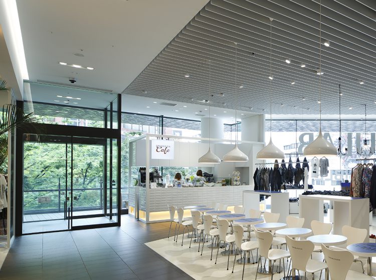
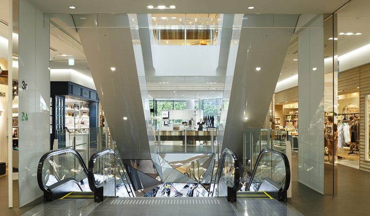
In order to maximize the tenant value on the first floor, this building is in the form of an independent roadside store that integrates the three levels of B1st, 1st and 2nd floors. These street shops have independent facades separated from the buildings and form a cityscape. However, the length of time the escalator moves up and down is a problem, and it is difficult to attract customers to the 3rd floor and above.
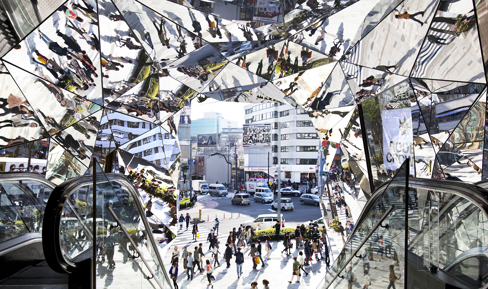
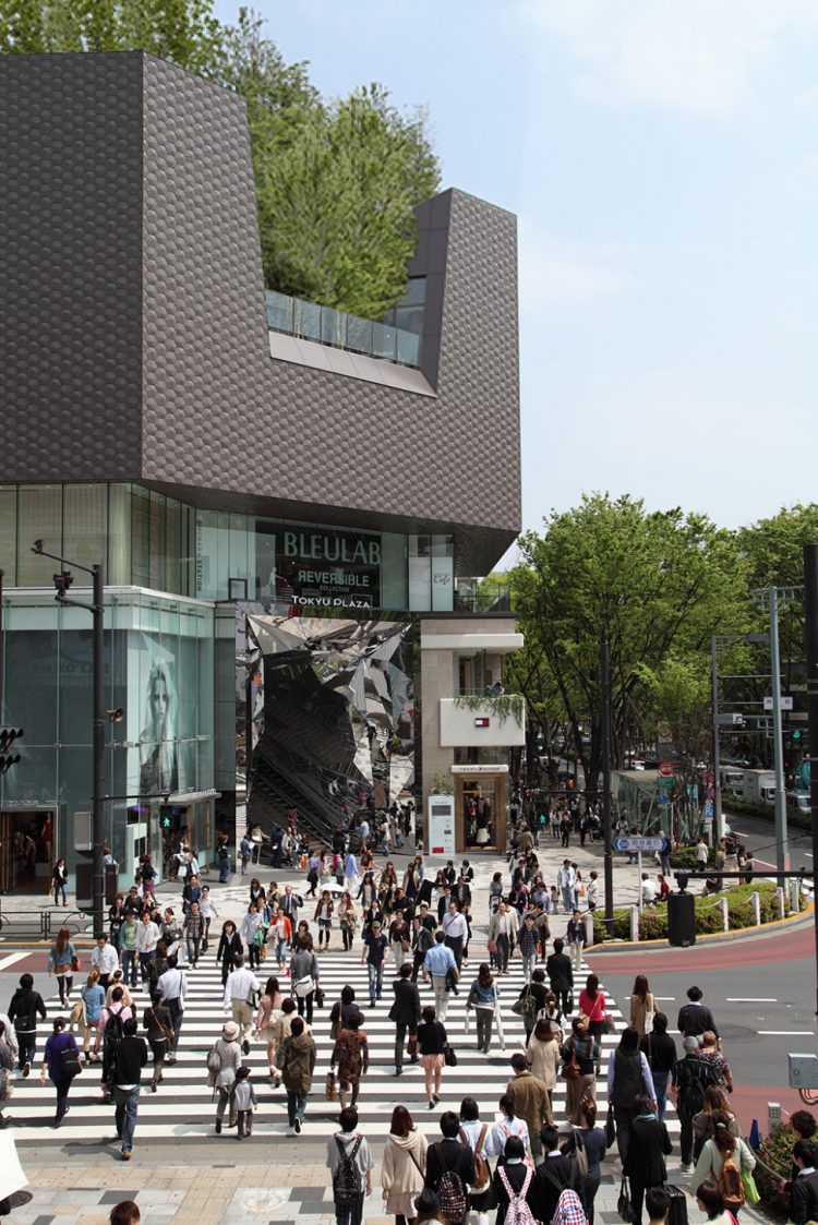
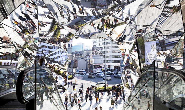
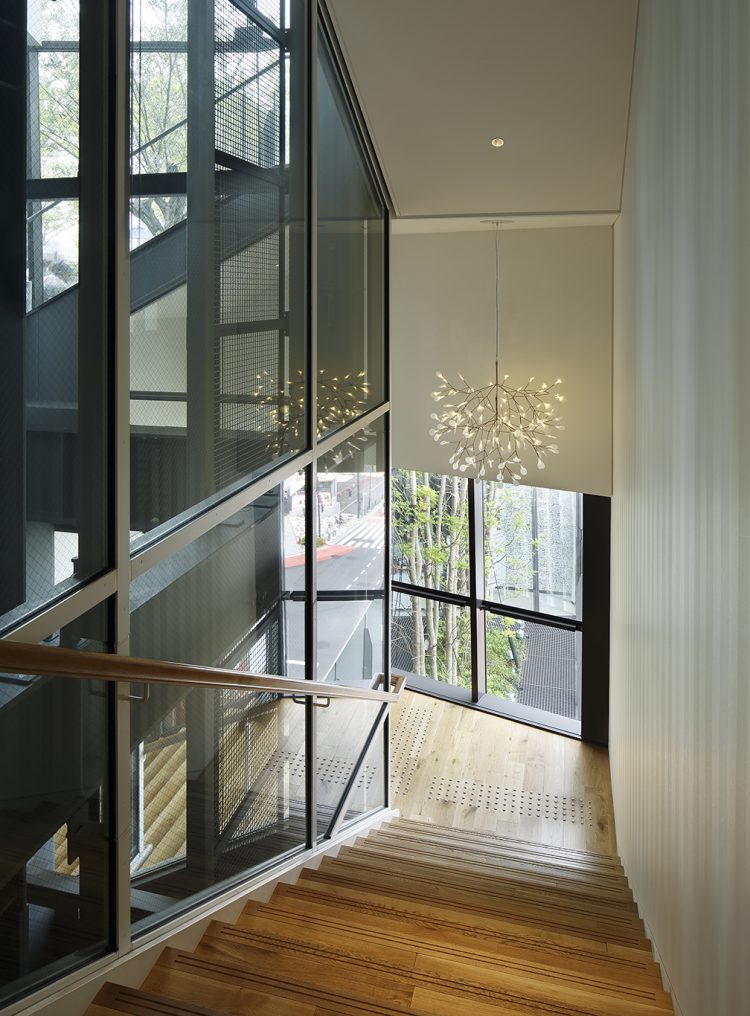
Therefore, we proposed an experiential flow space with a polyhedral mirror. A Kaleidoscope-like Entrance Tube Memory of the site’s past has been maintained in the entrance tube leading visitors to upper floors. The tube is a great mirrored space, its mirrors recalling the mirror wall cladding of the Central Apartments, which once occupied the site (a building that came to symbolize Sixties and Seventies youth culture). To see fashionably costumed people reflected repetitively in the mirrors, like colorful objects in a kaleidoscope, is dazzling in effect. A special sense of excitement evocative of the fashion world is produced, and the ride on the escalator becomes a rich experience. Attracted by the mirrored reflections of people passing through the intersection, one peers into the tube. On riding up the escalator, a great atrium appears with tree-filtered light spilling down from a skylight in the ceiling. Thus begins a shopping experience true in character to Omotesando.

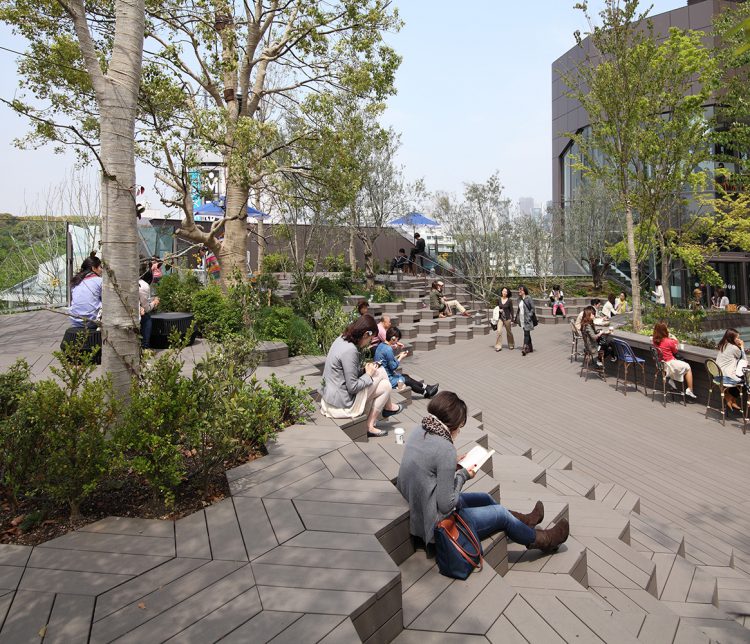
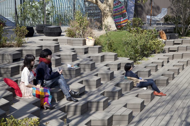
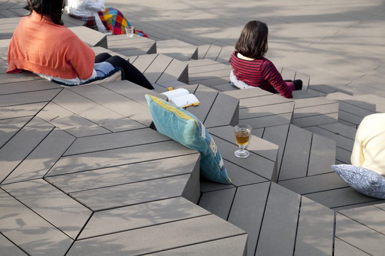
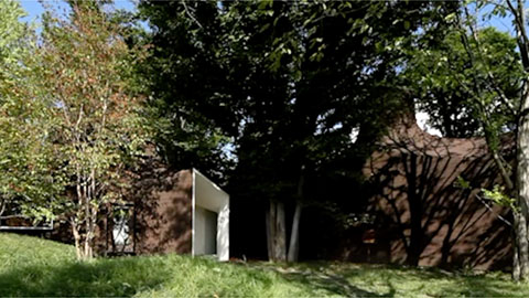
By establishing polygonal steps on the terrace, similar in appearance to the polyporaceae (bracket fungi) that grow at the base of trees, we could fill in the height difference created by the root clumps and produce a terrace of mortar shape. The polygonal steps have a multiplicity of meanings, for they serve not only as steps but also as chairs and tables. Through them, users enter a physical dialogue with the building. What particularly charmed us about the mortar-shape terrace is how visitors naturally gravitate to the lower levels of the terrace, seeking a center. There, the visitors seat themselves in the countless nooks around the terrace and share the scenery before them.


In these times, when Internet shopping is on the rise, it is important for commercial spaces to maximize the aspects they possess that cannot be replicated online. We felt that the relaxed sense of unity one feels in this comfortable environment abounded with distinctive places and pleasant physical experiences is precisely the quality essencials in commercial facilities in the future.
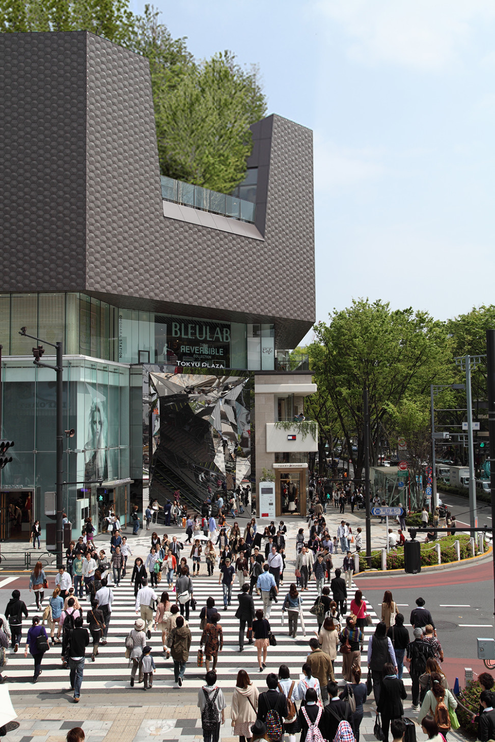
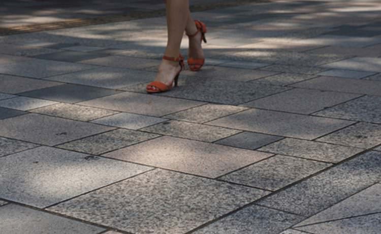
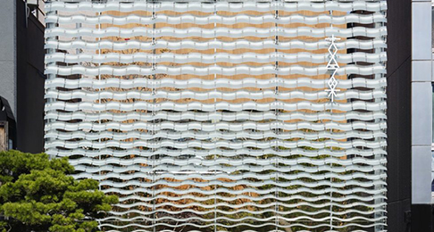
This building is an embodiment of the memories of Central Apartments' mirrors, and the iconic patterns of Omotesando's stone walls.
- Completion
- 2012.03
- Principal use
- Commercial
- Structure
- SRC+ RC+S
- Site area
- 1,771㎡
- Total floor area
- 11,852㎡
- Building site
- 4-30-3, Jingumae, Shibuya Ku, Tokyo
- Structure design
- TAKENAKA
- Contractor
- TAKENAKA
- Planting Design
- Mitsuko Suzuki / Siiaru-Club
- Team
- Satoshi Toda, Natsuki Mamiya, Atsushi Igawa, Hirotoshi Koizumi, Tomohiko Kimura, Kohei Taniguchi, Yuji Okanish
- 日本商環境設計家協会 JCDデザイン賞2013 大賞
- 2014 VIVA Best of the Best Awards, Honoree
- 2013 Asia Pacific Shopping Center Awards, Gold Prize for design & development excellence
